Wednesday, March 30

f8 and be there

Here's the winners in this years NPPA's Best of Photojournalism contest in the still category. Some amazing images.

I have a lot of respect for these shooters. I started my career as an assistant in one of the most prominent commercial studios in the state. My forte was studio work and lighting. I spent hours upon hours playing with light and composition, getting everything just right. These shooters, on the other hand, create images that are emotionally charged and dramatic right there, on the spot. I think it takes a great amount of talent to do that.

Tuesday, March 29

Coraline Gillet

I just came across French illustrator Coraline Gillet's Portfolio. A wonderful collection of images there. Great texture and brush work. My favorites are Atelier which shows bespectacled dad sewing up a boy's teddy-bear, and la haut, an image of a young girl petting a cat under a full moon. I wish I could read French.

Evidence

I've speculated about this for years. It's cool to see scientific studies in the subject. I like this quote:


Intelligent individuals who are bombarded by ideas seek to make sense of them by organizing them into new perceptual relationships. Thus the creative, original idea is born


I wish ADD/ADHD was understood when I was a student. Most teachers back then wrote you off as some sort of immature day-dreamer. My oldest son has ADHD that he inherited from me, but is doing way better than I ever did in school because there is knowledge and support. And as far as the creative connection goes, I think my son goes far beyond where I was at his age in terms of his creative conceptual ability. I remember him drawing a picture of his baby brother when he was in first grade, and he draw everything in a rudimentary one-point perspective.

Saturday, March 26

Gill Bold

The great designer Bob Gill wrote a book in the mid-80s called Forget All the Rules About Graphic Design: Including the Ones in This Book. My parents gave it to me when they were cleaning out their library (another advantage of being the son of two designers). It's out of print (available used), but a valuable contribution to any designer's bookshelf.


Of all the lessons he teaches in the book, there is one that continually comes to mind. If the message you are communicating is dramatic, loud, dynamic, interesting, bold, etc, then simplify the design elements and let it speak for itself. If the message you are communicating is bland, boring, dull, quiet, etc, then make the design the opposite to pull the viewer into it.


It reminds of a Communication Arts advertising column from many years back entitled "Creative Brats and Creative Adults". I've long lost that particular issue, but there was a great line I'll paraphrase. "A creative adult is one who realizes that an ad about finding the cure for cancer should have a headline that reads 'We've found a cure for cancer' in giant 120 pt Helvetica extra black, all caps".

Thursday, March 24

Jazz and the Grid


Jazz is my favorite musical genre. Be-Bop and Swing era artists are usually the top of my playlist (although I'm a sucker for a Diana Krall torch song). The aspect of jazz that appeals most to me is the loose, improvisational nature. Start with 2 parts tight rhythmic groove, add 1 part simple melody and mix generously with 4 parts musical shenanigans.


Jazz relies heavily on soloing. Most jazz tunes have more bars dedicated to solos than anything else. But always there is the underlying rhythm and song structure that keeps the identity of the song intact. The solos are always framed around a melodic idea. Every time Duke Ellington and his orchestra played C Jam Blues, the experience was unique, but you always knew what song it was. Ben Webster would take that melody all over the country-side (sometimes into the next county) and back again, yet it was always familiar. The groove was intact.


Most creative endeavors need that underlying groove for structure. I find I'm more creative in my work when I have limitations and boundaries. While this seems to be at odds with the idea that creativity is limitless exploration, it really isn't. Adding a wall or two to the beginning of the process provides direction and focus for the artist's energies.


Many times the walls have to do with more "technical" restraints; the simple frame of a canvas or the complex 7-column grid of a brochure layout. I'm in the midst of a 20-page brochure. Each page has pretty much exactly the same elements (headline, main visual, body copy, pull-quote, company division ID). Because I've placed that 7-column grid underneath, each page is also a unique layout, with nothing repeated from spread to spread. I can riff around the design's melody and everyone still can recognize the song.


Another advantage to placing boundaries in the creative process is that it provides a starting point for the brain. The blank, white page staring at you is much more daunting when there is no starting direction. Free Jazz (my least favorite) tries to build a song on nothing. The players just jam without any underlying musical structure at all, and it's hard on the ears to all but a few.
Monday, March 14

artist feature: Tal Walton


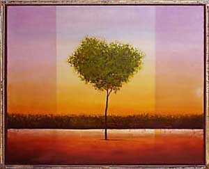
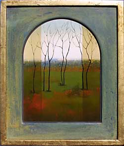
I first came across Tal Walton in the pages of SouthWest Art (one of my favorite art magazines) when he was being profiled as one of the new up-and-coming painters. There was something that instatnly caught my eye and I've been a fan since. He paints in the Tonalist genre, oil on hard surfaces (panel, marble ground, etc), mostly imagined landscapes. One of his trademarks is the division of the image into three sections, which he describes as representing the past, present and future.


My paintings are very religious. They stem from my background. When it comes to the landscape, I strive not to imitate actual places, but to re-create the universal idea of landscape in time. When people look at my work, I want the simplicity to draw them in and the underlying complexity to hold them there. I want them to pause for a moment and contemplate the meaning of their own lives.


Walton is a Utah native with both a Bachelors and Masters in Fine Art from Brigham Young University


An excellent collection of his work is available here.


Sunday, March 13

TypeNavigator

The FontShop has a new tool for finding fonts, TypeNavigator. It uses a multiple-choice method of selecting font features within a genre. Select "Humanist Serif", for example, and then click your choice of serif style, character width, character contrast, etc. This pulls up a search result based on fonts with the closest matching features.

At the moment, only FontFont's library is available, but according to Typographica, the Linotype collection should be live soon.

The font previews were small and the anti-aliasing was a bit jagged. I really couldn't see enough of any font details to really feel comfortable buying anything. If you want to try a custom, larger preview, you have to go back into the FontShop site and find that font again. There also could be a few more choices to refine the search further.

That being said, I think it's a great idea and a good, solid start. There are so many great typefaces out there that get missed because it difficult to search by a visual feature. Kudos to FontShop.