Wednesday, August 1

Where ideas come from

A question was asked on LinkedIn.com about brainstorming sessions. Since this is one of my favorite business activities, I though I'd share my answer here (with some added bits) as well.

This is my process for conducting a brainstorming meeting:

1. Solidly define the question. This sounds like a no-brainer, but I think many times it's glossed over and the results don't really hit the sweet spot. Anyone you who have read Douglas Adams Hitchhiker's Guide to the Galaxy series knows what I'm talking about. The answer is 42, right?!

2. Set the stage. During the first part of a brainstorming session, there can be no editing or negative commenting on any ideas thrown around. A fun idea is to give everyone a Nerf ball, and whenever someone makes a negative comment about an idea, the rest of the group throws the balls at them. THIS IS THE MOST IMPORTANT PART! Obviously not every idea that is said will be valid, but with the right environment those ideas will trigger other ideas, and people will be more creative when they feel safe from criticism.

2. Using a whiteboard or large post-its, write up each thing said. Using a mind-mapping approach might help, showing how ideas are related. It depends on what kind of people you have, though. Some people respond best to just random listings. There will be several lulls during this period. When you get to a lull, try implementing a triggering activity, like word-association, or asking to visualize a juxtaposition (i.e.-what would this product be like if it was a military person). Sometimes, I'll throw out an obviously outrageous idea, just to get a laugh and that will start people back thinking again. The goal of this phase is quantity not quality.

3. Editing. After everyone is worn out & tired. Take a break, then go back to the ideas and begin to discuss the merits of each and edit. Go over combinations of ideas and push some further. There will be ones that everyone hates, have some fun when you cross them out. This is also the time for thinking about implementation issues.

Some things to keep in mind:

1. Everyone needs to be comfortable. Board rooms are the worst environment for this activity. Go offsite if you need (sometimes this helps a lot!). Get good chairs or pillows, allow everyone to dress how they want and keep the room temp around 69.5 degrees. This also goes for the emotional environment. Make sure that everyone feels accepted and part of the group. Many people will not offer ideas because self-doubt and the fear of criticism creep in. When they can trust that they won't be made fun of, the ideas will come out.

2. Food is always good. Fruits and nuts, crunchy things, jerky, cheese. Stay away from pastries and such. Some soda is OK. Water is good. And make sure it's quality food.

3. The person driving needs to be "on". Keep things light and fun. Run around with energy & compliment ideas. Keeping the group energized and excited will produce more and better ideas. Another key thing is that you can't be the boss. Push the ideas, not the people.
Wednesday, July 18

Fresh coat of paint

My agency, Eurekaville Advertising & Design, has just launched a new identity and website! I'm proud of the results and invite you to take a minute and check it out.

Eurekaville Advertising & Design

Monday, July 2

Type Nerdery

It took forever, but it was worth it.

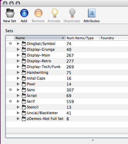
I spent about 3 hours last week culling and sorting my type library in Suitcase Fusion. I had gone through this process on my old PowerBook about 3 years ago, but after switching to an Intel Mac and a new office, I kept putting it off. Not only did I sort and categorize all my fonts, but I threw out a ton. You know, all those way out-crazy fonts that are free that really we’re never going to use, but they were free? Gone. I’m down to 2116 fonts in 1715 families. I could probably cull some more, but I’ll feel inadequate as a designer if my type library is too small.

So here’s a peek at the way I organized my fonts:


Statistically, I have:
618 OpenType fonts
586 PostScript fonts
902 TrueType fonts


I’ve only actually purchased about 20 or so fonts. The rest came from software installs (gotta’ love Adobe for that) or were available free (legally) online.

My next type purchase is probably going to be either FF Meta (I’m in the market for a new workhorse sans face) or Incognito (Just waiting for a logo project to come my way so I can get all jiggy with this font). I’d love to buy Mark's Proxima Nova, but I’ll have to wait for a big identity project to subsidize it.

I blame my mom for all this. She’s a designer as well, and I remember pouring through her old Letraset catalog and playing with rub-down type at the young age of 7. I knew what kerning, keylines and photostats were before I was in Jr. High.

I guess my grandfather is partly to blame as well. He was a printer and was constantly sending over boxes of paper and stuff for us to play with.

Monday, December 12

Interview with Pete McArthur

Pete McArthur has been one of the most prominent commercial & advertising photographers in the field for quite some time. His images are highly conceptual and he's developed a look and feel that is uniquely his. He's also started his own stock photo division. We chatted via e-mail recently.


KW: How about a basic one minute bio to start?
PM: I was originally trained as a graphic designer and later switched to photography just to avoid working with type frankly. I graduated from the Art Center in Pasadena in 1982 and by some twist of fate have wound up teaching there part time for the past 15 years which has been a wonderful compliment to my usual studio work.

Bio as follows:

Kendall School of Design/ Advertising. Art Center College of Design/ BFA Photography. Illustrative still life photographer, Pete McArthur Visual Art Services, Culver City. Clients include: Kohler, Xerox, IBM, Microsoft, Sylvania, Corona, Knudsen, Wells Fargo, Honda, Nissan, ATT, Capitol Records and Kodak. Awards: Communication Arts, Print and American Photographer, AIGA/Los Angeles. Organizations: Past board member and current member of The Advertising Photographers of America, L.A. chapter and member of The Picture Archive Council of America (PACA).

KW: Who were your early influences?
PM: My earliest influences were actually painters. Wayne Thiebaud and Paul Wonner in particular played a big role in the early stages of developing my style. Through the years I've borrowed from others like Picasso, Warhol, Vasarely and even some of the Dutch still life guys from the 1600's. I think if you look at my body of work as a whole however, you'll keep seeing my personality and individual point of view running through most of it even with these other underlying influences.

KW: How about now?
PM: I'm still very interested in what some of the realist painters are doing but have become more aware of a need or craving on my part to demonstrate some of the things photography does best like revealing "truth" and in turn fooling the eye. One photographer I've been following through the years is John Phfal. I think he has the most elegant point of view in the medium I've ever seen.

KW: Has your approach to your art changed much over the years?
PM: Yes, I guess in some respects you'd have to say I'm more a product of commercial influences rather than art. What I've come to understand is that as commercial photographer I've worked very hard to make images for others and my success or failure rests with the client's opinion of the outcome. At the same time, I've always been rewarded for my particular contribution within each project and it has been this input (sometimes conceptual, sometimes graphic, sometimes just outright problem solving) that has been the constant in my work. Most of it has been collaborative and that's the way I really work best.

KW: What is your creative process? Walk us how your work out ideas for an assignment.
PM: It varies depending on whether I'm working in advertising, design or editorial. In advertising, the concept is usually already worked out and in most cases the visual is right there too. My contribution is more in terms of rendering and composition.

For the design and especially editorial projects, I'm responsible for the conceptual direction of the images as well as tying them all together in a nice looking package.

I usually get some kind of manuscript and if possible a headline in editorial, in design it's usually a rough layout of the piece and the key image points for each shot. After a 10 to 20 minute conversation with the AD I'll take the notes and layouts and start outlining concepts and noodeling thumbnails in my sketchbook until some of it starts making sense. I find Roget's Thesaurus very helpful in dredging up visual clues from the various keywords in the project. I'm big on paper, scissors, Xerox copies, color pencils and tape. I need those sounds and smells to keep me excited and to keep things fluid and tactile.

I usually present three different directions in thumbnail form, just B&W line drawings. The art director and I refine these with feedback from their CD, editor or client and then a set of color final comps are presented before going into production. It the same model used in advertising and while some may think it a little stiff or limiting, it really gives all of the parties involved a stake in the final images.

KW: You mention lots of paper and pencils and being tactile, has technology affected the way you work?
PM: I think it's really helped me as far as saving time filing, retouching and made communications easier and faster. As far as creativity, I don't think it's effected me as much as one would think.

KW: Do you build much of the sets and props for your images?
PM: Yes, I have a shop for fabricating much of the props and sets, which I either make myself or engage the help of an assistant on larger projects. My model making abilities do have limitations and for the occasions where we need some special prop or large set, I'll just hire it out.

KW: Is there someone from outside photography that has influenced you creatively?
PM: Outside of the painters I mentioned earlier, my biggest influence was my parent's encouragement in my earliest creative pursuits. From the darkroom in the basement, the silk-screening and airbrushed t-shirt years, and bumping from one art school to another, if it wasn't for them I'd just be another draftsman sitting in front of a CAD program. Photography would have stayed a hobby.

KW: What is your most effective creative environment?
PM: Being partnered with an enthusiastic and talented designer, confronted with a challenging visual problem and being supported by an understanding client with a reasonable deadline and lots of money. Seeing as how this has only happened six times in my entire career, I'd settle for just the enthusiastic designer.

KW: You took the stock image issue head on by creating your own stock library. I know many shooters have felt a pinch from the current glut of cheap stock images. What do you see as the future when it comes to stock vs. assignment?
PM: On the future of stock vs assignment: I don't look at the trend as having to be mutually exclusive. One thing that has worked well for me has been by actively operating my own stock business; it has allowed me to stay in touch with clients that would have otherwise been dealing with a stock agency on a regular basis rather than myself. This keeps me in-touch with their needs, buying habits and also leads to combining sales of stock images with assignment shots. I'm also much more knowledgeable about my own library than any stock house sales rep. The difference is this: I think of the designers who use my work as clients buying a service as opposed to a stock agency treating them more as customers buying products.

From here forward, the big question for me is: With the trend in image buying tilting heavily towards shopping rather than directing photo shoots, can I continue to convince designers that creating new images from scratch is just as cost effective and just as convenient as trying to pull together eclectic collections of existing stock images and trying to work them backwards into concepts while at the same time trying to make the edited group look as though they all have a common point of view. I have the most fun and get the greatest satisfaction working with these talented people in a creative capacity.


Tuesday, November 29

Meeting "da' Man"

The week before Thanksgiving I took a business trip to Utah. While I was there I took time to catch up with old friends. I also had the opportunity to grab lunch with one of web design's rock-stars-Cameron Moll.

I met Cameron via his blog a couple of years ago. We've e-mailed back and forth a bit and he and Greg were both invaluable in helping me to get the CSS for this blog (and other sites) working. He's always been generous with his time and talents.

He graciously took me out to lunch at a wonderful place called Tucano's, a Brazilian BBQ place in Provo that is now one of my favorite restaurants ever. He also brought the wife and kids, which was fun. Suzanne is very nice and his four boys are cute as all get out, but they were also extremely well-behaved. I have 5 kids and the Moll family has much better table manners than the Walker clan when eating out.

All-in-all, it was great to meet him in real life, have a face and voice to the name and find out that he's as cool offline as he seems online.